Ornn
Ornn wanted their brand to feel more institutional and a bit less techy, so Haptic proposed a new serif and a simpler logo. I built a tool that redraws the logo from the rules of the original, so the brand team could try versions quickly and keep them in the same language.
- Role
- Design engineering
- Client
- Ornn, through Haptic
- Made for
- Haptic’s brand team
- Built with
- React, DialKit, SVG
The brief
Ornn is a GPU marketplace, and their leadership wanted the brand to feel more institutional and a bit less techy. Haptic proposed a new serif typeface and a simpler version of the logo, which is a loop made of horizontal bars.
I came in once the first version of the new logo was done. The brand designers had been redrawing every option by hand, which was slow, and each version drifted a bit from the original. So I wanted something that could draw the logo from rules, which meant I had to work out what the rules were first.
The logo
I traced the original and measured every bar. Each half is the other one turned upside down, and down each side there are seven stripes that get thinner as they go.
Five of those are bars, and the last two are the ends of the bars that curl round from the other half. Seeing it as one stack of stripes made the rules pretty simple.
One half, turned upside down
Each half is the same set of bars turned 180°, so the thick bars at the top of one side are the thin ones at the bottom of the other.
Rebuilding it
The tool draws every edge from a few curves I fitted to the original and the list of bar heights, so nothing is a stored shape that gets stretched.
When you change the number of bars, it spreads the heights and gaps across the new count, so the bars still go from thick to thin and the ends at the top and bottom get rebuilt too. I laid the default version over the original to check it, and it’s pretty much identical apart from a small step on the top bar.
The tool
Options
Here are a few of the versions it makes, all drawn from the same rules as the original.
What I left out
My first plan was to build the logo as a 3D cylinder and cut the bars out of it.
When I measured it properly, the ends of the bars are thinner than the bars themselves by a different amount each time, which a real cylinder wouldn’t do. A 3D model would have meant making up geometry I couldn’t check, so I stuck with the fitted curves, which I could check against the original.
Where it’s at
It means the brand team can try versions in seconds, and we can share the tool with Ornn too, so everyone can get the logo somewhere that feels less techy while it stays in the same language as the original.
I shared it with Khadijah on Haptic’s brand team first, as a way to explore a compromise, a simpler loop that keeps the shape and symmetry of the one Ornn has now. Where the logo ends up is up to Haptic and Ornn.
It went down really well with the team, and Ash gave me a spot at Haptic’s show and tell on 2 October to walk everyone through it. I really enjoy making tools like this, so that was a nice one to get.
Khadijah
so good @Joe P-R 💥
Oli
cc @Darren
Ash
@Joe P-R you’re getting an October 2nd Team Show n Tell spot for this! ⭐
Jordan
That’s wild
Darren
Crazy @Joe P-R
Illustrations
I was then asked to build out a new careers page for Ornn, which meant we needed to make some more of the line illustrations they use across the site.
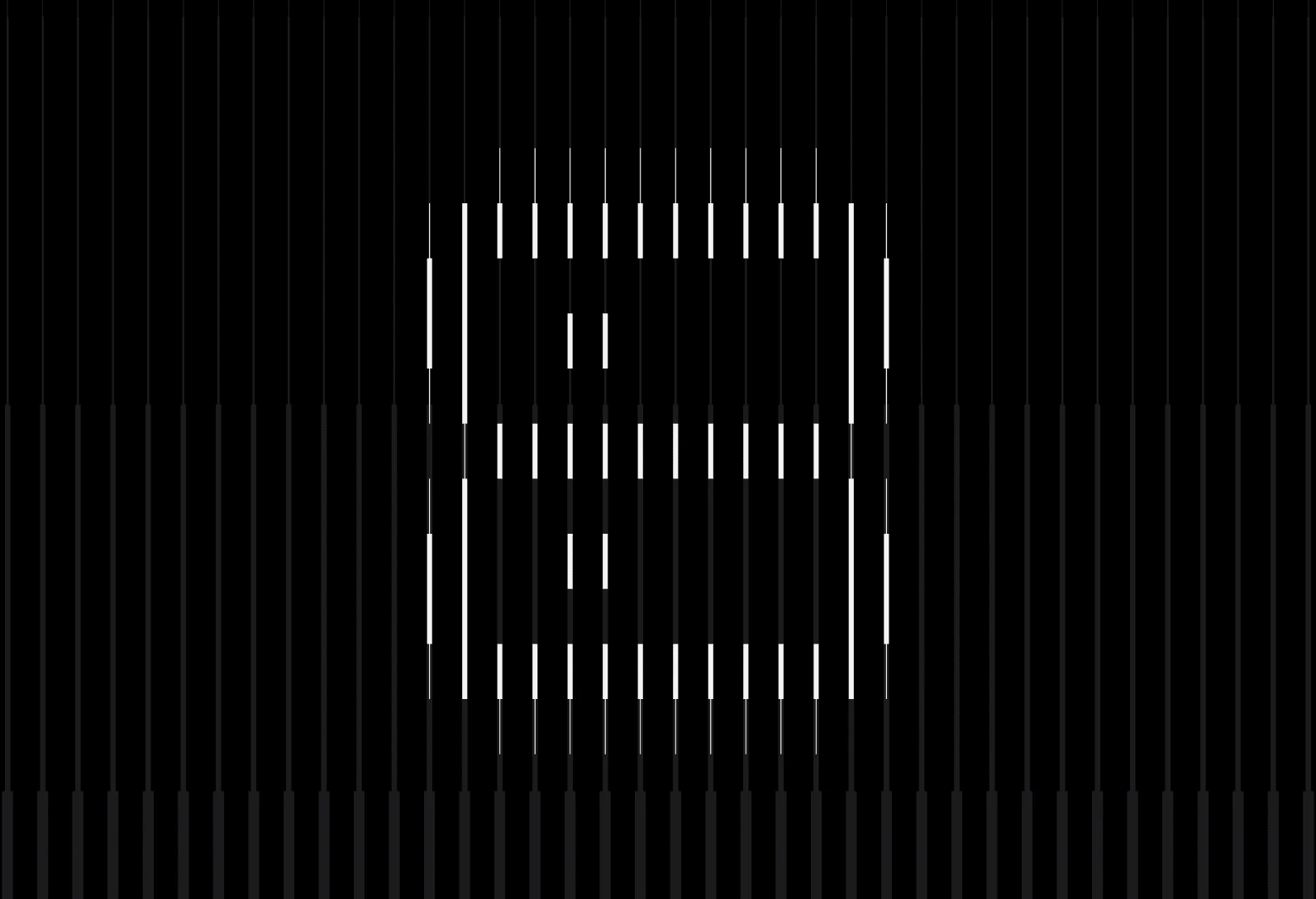
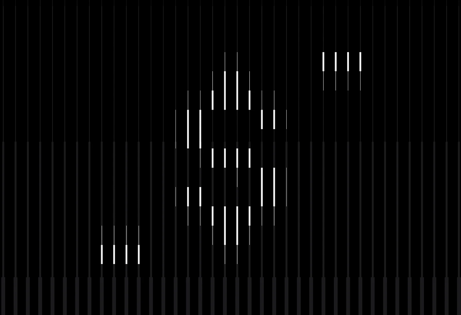
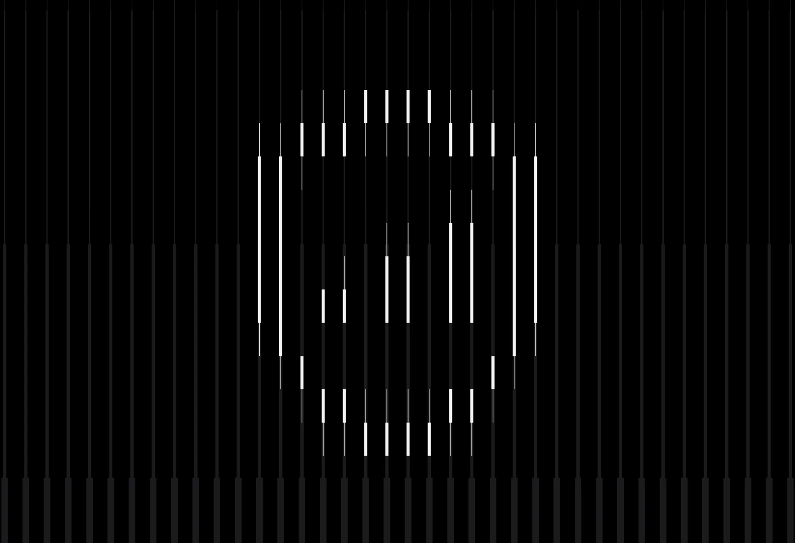
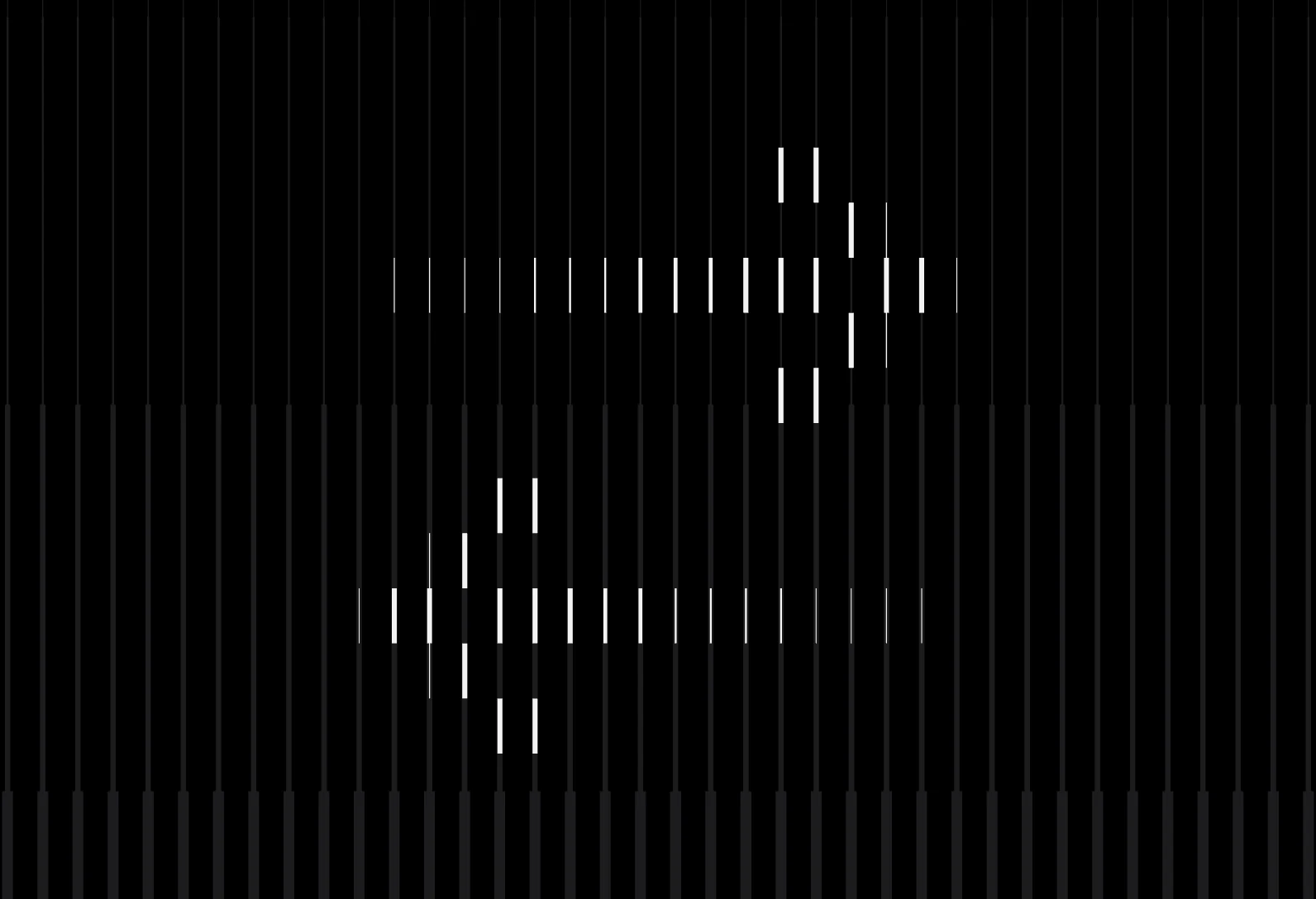
As with the logo, the team were drawing these out by hand, so I built another tool. You draw straight onto the grid the site’s illustrations sit on and every line snaps to it, so whatever you make follows the system.